It seems I get to February every year and NEED to rearrange the school room. (You can see past iterations of here.) This year I needed more shelves so there weren’t boxes full of books to pull out and dig through constantly for school. I also needed more work surface so that Brenna could spend more of her time downstairs with the rest of us.
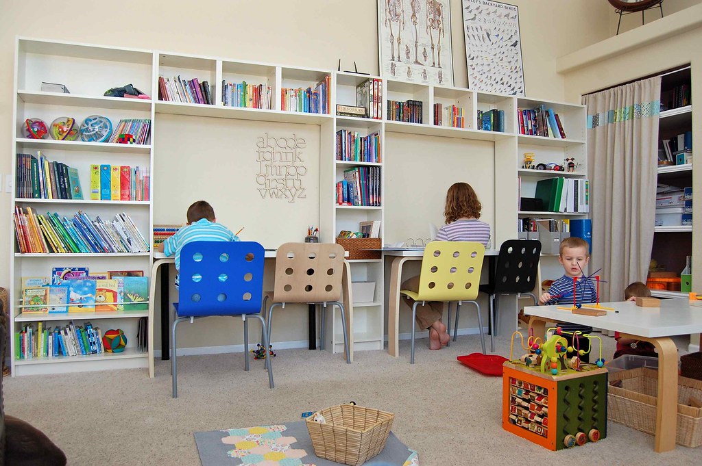
We also needed more desk space so that kids weren’t constantly distracting each other, poking each other, spilling milk on notebooks, you know, the things that happen when they are all working around the kitchen table. I certainly love the IDEA of harmoniously working around the kitchen table, but it just wasn’t my reality. Now one child can be at the computer desk working on Khan Academy math, one can be doing English at a desk, another can be writing about history at the other desk, and the little boys can go back and forth from the block building table in the school room, to the art room table where they cut and tape to their hearts’ content.
It took a couple of trips to Ikea to get all that we needed. We’ve got some Billy bookcases and wall shelves, some Vika table tops, and Jules chairs. (I wasn’t present on the chair acquisition trip. I would have insisted on a red chair rather than a black one, but oh well. That’s what Jonah wanted.)
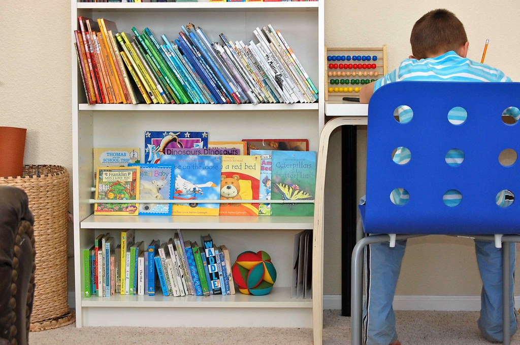
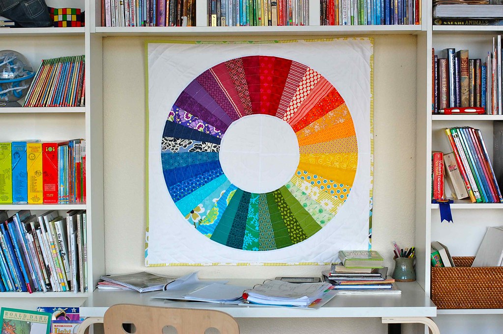
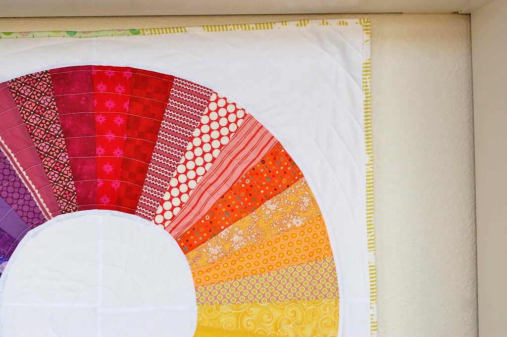
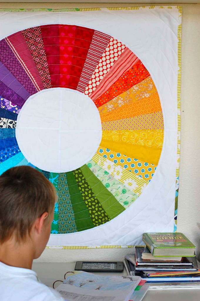
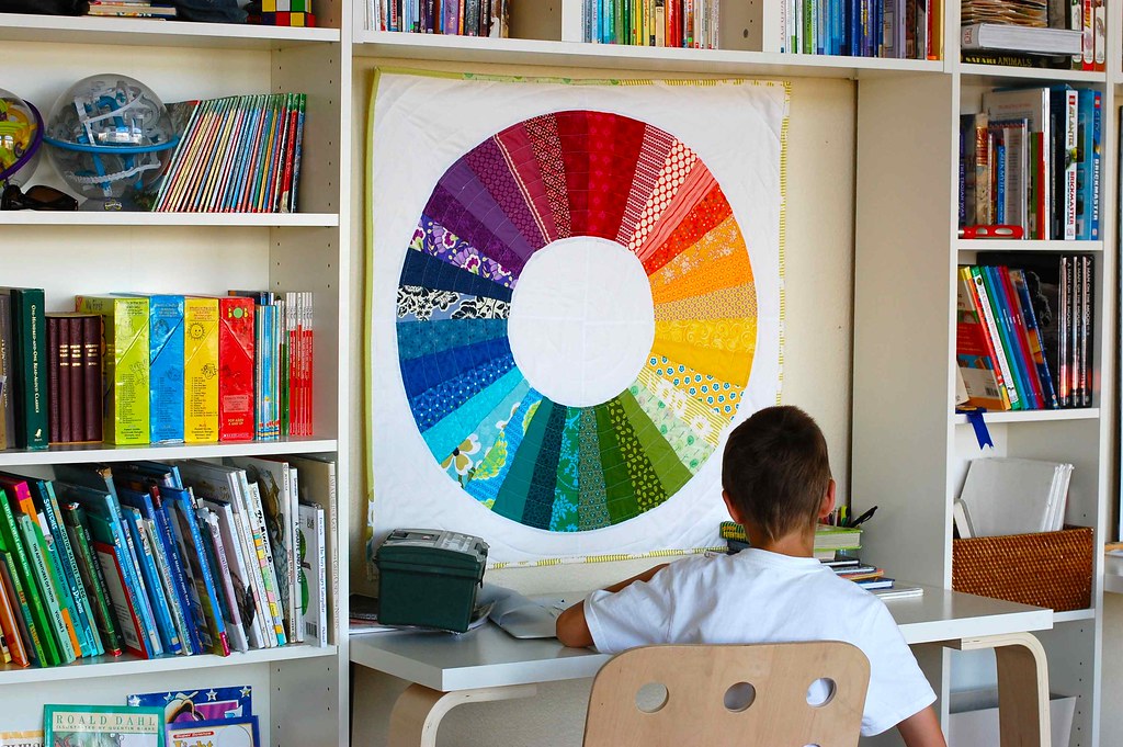
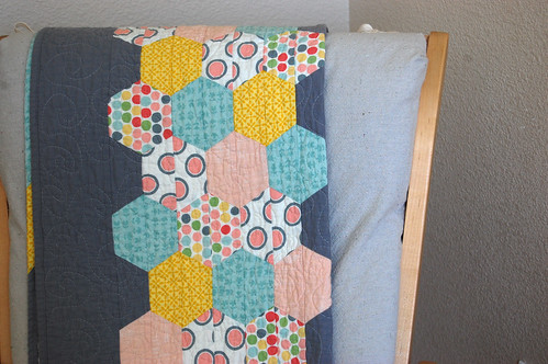
Can I tell you how much I love it that the books on these shelves are arranged by color? I love it! It makes me smile, and surprisingly my kids keep putting them back that way too. It also makes me really want to make some mini versions of this color wheel quilt to put in those spaces above the desks. Wouldn’t that be perfect? and fun? and beautiful? Other decorations I have on the brain are pillows like these for the couch. I’d need to learn to crochet, though. Oh, and some time and energy.
I’ve made the bottom shelves for the littles– board books on the bottom, and a smattering of paperbacks (which I rotate from the stash) propped up with little tension curtain rods. Other low shelves have a toy basket for sweet Eva, and some trays of wooden blocks and cars.
So, with the shelves coming in here, the piano had to move to the living room…
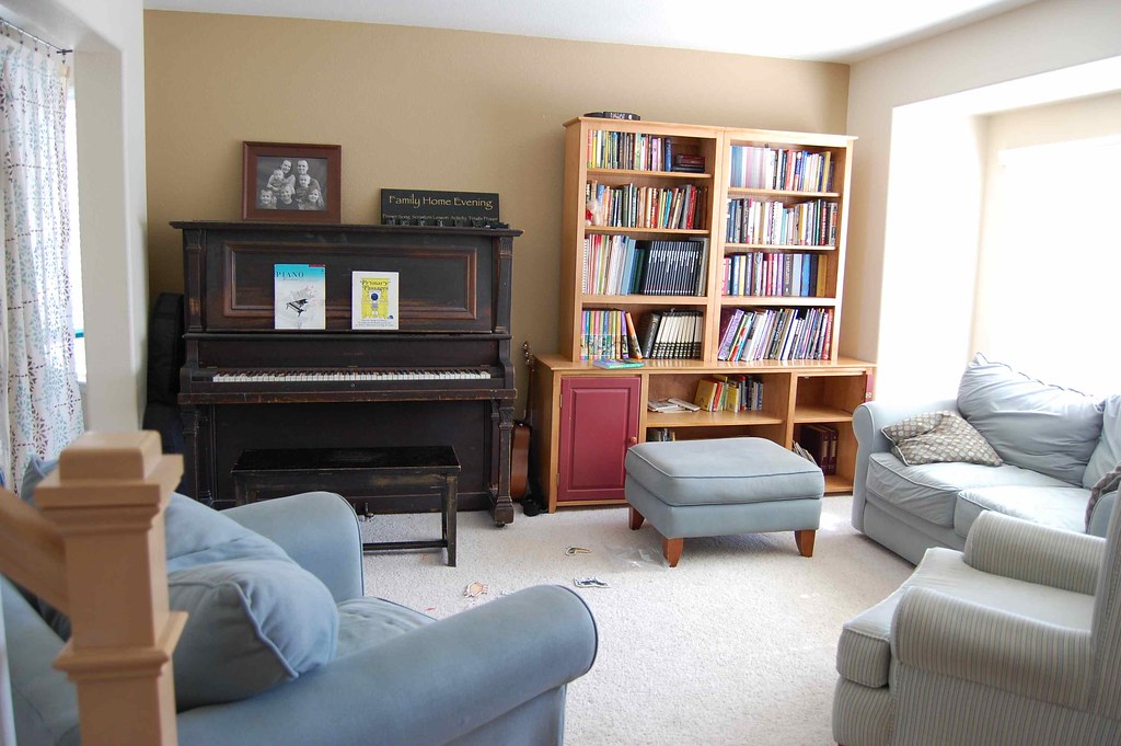
I still need to get art hung in here. I also need to help my poor worn out furniture. The cabinet doors have been broken and fixed one too many times. They just need to be replaced.
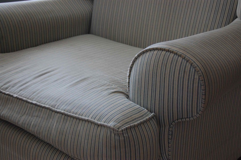
My frayed striped wing back chair has seen better days. I’m hoping I can get a washable slipcover made from this fabric I designed. This year. Sometime.
And so, with the piano moving in here, shelves had to be moved up to my room.
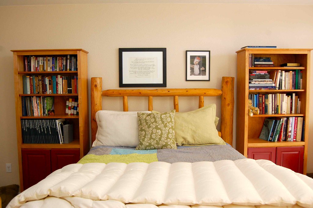
I’m loving how the shelves warm up my room and give us makeshift night stands. I want to paint the cabinet doors brownish black to match my new dresser. The pictures above our bed need to be rearranged still, and I’d really like to add a nice Boise Temple picture up there too.

Oh, Ikea, how would we live without you? I’ve had this dresser in the master plan since before we moved here. I love its smooth opening drawers, and how it looks with my Karl Blosfeldt prints above it.
While we’re at this home tour of sorts I’ll show you the entryway and stairs.
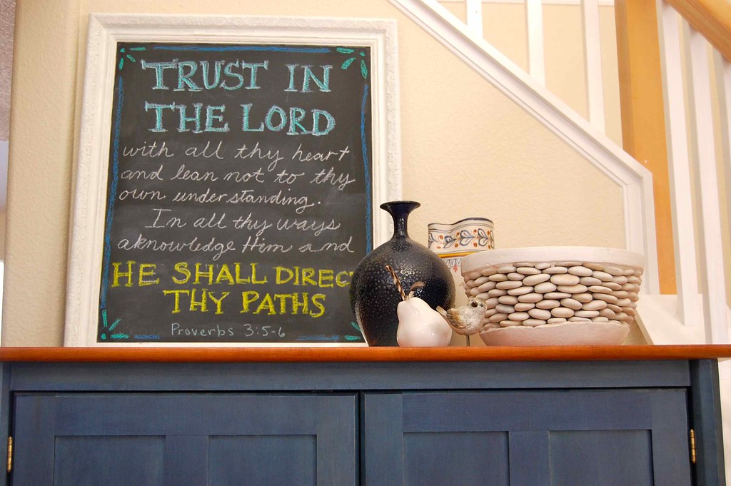
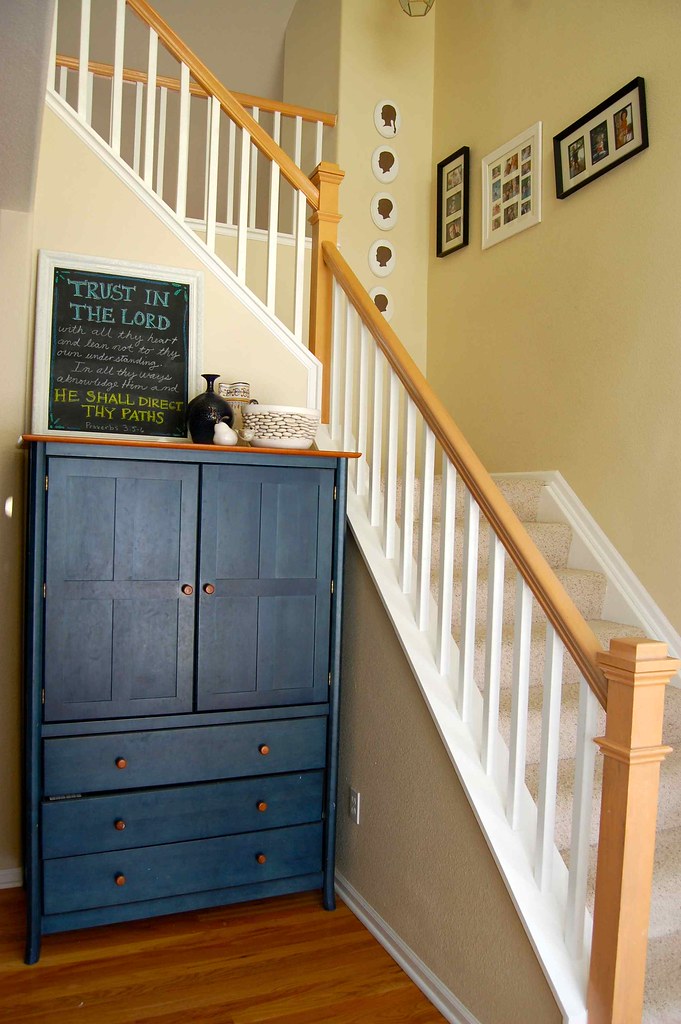
I really want to create a better gallery wall of family photos along the stairs and make new silhouettes of the kids now that we have a new one added to the crew. I’d also love to add this letterpress print of the Salt Lake temple.
Well, that was a brain dump. I’ve had all of this on my mind so much as I stare at my walls and move around my house everyday it’s nice to have it in writing and photos. We’ll see how long I just dream these things up and what actually gets done.